Today marks an extraordinary moment for us. We’re proud to introduce our new identity to the world. This new identity signifies a major visual transformation in how we present ourselves. We’ll guide you through the details of our new identity, providing an intimate insight into the decisions and thoughtful considerations involved in this transformation. Moreover, we are eager to explain the driving forces behind this change and describe the impact of this new identity on our mission.
Saying goodbye to our previous identity
As we say goodbye to our cherished old identity, it’s essential to acknowledge its critical role in launching our foundation. The iconic logo held immense sentimental value, symbolizing our early journey. However, the passage of time revealed some of its inherent limitations. While deeply valued, the logo had limitations on recognition and memorability. Those limitations impacted our ability to make a lasting visual impact. The symbolism, though meaningful, at times appeared ambiguous to some audiences. Moreover, practical challenges emerged; the logo needed to be more adaptable to some communication channels, and the color palette had limited versatility. With the evolution of our foundation, we recognized the need for a fresh, dynamic identity that aligned seamlessly with our vision, ensuring enhanced recognition, clarity, and adaptability across diverse media platforms.
Meet our new identity
Before we explore the story behind our new logo, let’s first immerse ourselves in the aesthetics of our new identity. Our revitalized identity introduces fresh air with a revamped logo transcending mere design. It captures a compelling story. The vibrancy of our carefully curated color palette infuses life into our communications, creating a sophisticated visual image. The meticulously selected and thoughtfully integrated typography serves as the exquisite finishing touch to our comprehensive design overhaul.
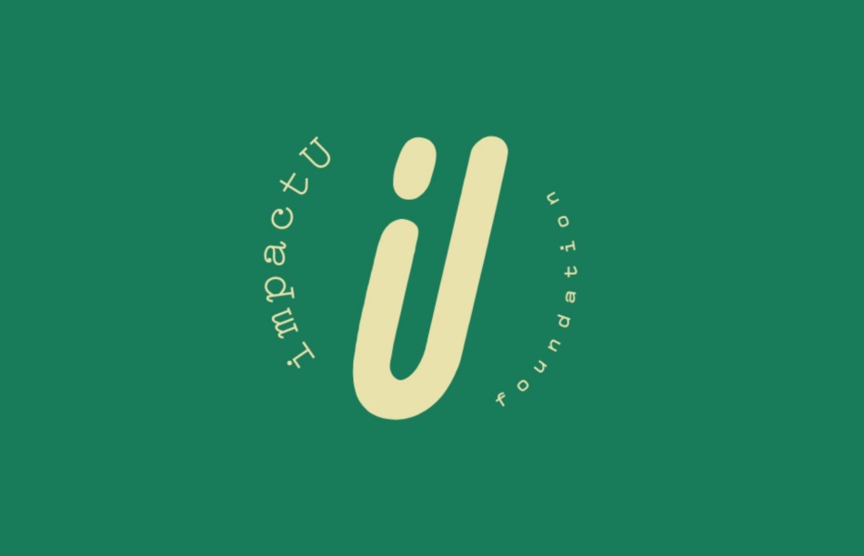
Our new logo captures an individual reaching out to help others grow. It symbolizes mentorship, support, and the interconnectedness that defines the impactU community. The central figure embodies the spirit of empowerment, with arms outstretched to uplift those in need. We want to recognize the power of the individual within our collective impact. The logo represents the ripple effect that occurs when one person’s dedication and support inspire growth in others. It’s a reminder that every contribution is crucial in the larger tapestry of impactU’s mission, no matter how small. Furthermore, the logo resembles the letter “U” in impactU. That connection is a powerful representation of the central role that university education plays in our mission. This letter symbolizes our unwavering commitment to making a meaningful impact in helping students in Latin America in their pursuit of higher education.
Next, let’s talk about colors. A sound color palette defines a set of favorite colors that make an identity look and feel right. Our new palette combines Eucalyptus green, Chamois beige, Buttercup yellow, Cinnabar red, and Aztec black. This array of colors provides many pleasant combinations with excellent contrast. That flexibility allows us to adapt our communications to diverse communication channels, whether a billboard or an Instagram feed. A sound color palette isn’t just about looking nice; it’s about making your identity easy to recognize and remember while being flexible.
The last component of our new identity is our new font, Compagnon. This font blends a sophisticated appearance with simplicity. Its clean lines and balanced proportions make it legible, ensuring a seamless reading experience across various mediums. Whether used in print or on-screen, Compagnon showcases versatility, adapting effortlessly to diverse design contexts. The font’s gentle curves and subtle details impart elegance, making it equally suitable for professional and creative applications. Compagnon adds a touch of classic charm while maintaining a contemporary edge.
As you can see, a professional identity defines a distinct visual image. It involves integrating elements like the logo, color palette, and font to narrate a story. The logo acts as the face of the identity, encapsulating its values and purpose. The chosen colors evoke emotions and aid recognition, reflecting the identity’s character. Consistency in font usage enhances readability and reinforces visual coherence across different platforms. A successful identity blends aesthetics with strategy, creating a memorable visual narrative that resonates with the audience. It transcends mere visuals, becoming a potent tool for recognition, building trust, and leaving a lasting impact on observers.
What about our mission?
Now, let’s address the elephant in the room. Does the new look mean changes to our mission? Absolutely not! Our hearts still beat for the same reason we started this journey. We’re here to empower disadvantaged students in Latin America to pursue their university dreams. How? Well, with the fantastic team of volunteers growing more robust and the incredible 100+ donors who make it all possible. Shoutout to our amazing volunteers. You’re the unsung heroes, the backbone of this project. And to our donors and event attendees, you’re the secret sauce that makes everything possible. With your dedication and generosity, the impactU family continues to grow.
Your thoughts matter, always!
We would love to hear from you as we share our excitement for the new identity. Do you have any suggestions, or do you just want to share the love? Contact us or hit us up on social media. Your impressions fuel our journey, and we’re excited to embark on this new chapter with you.
Cheers to a new identity, a fresh image, and the collective impact we’ll create together.


